Thursday, July 27, 2006
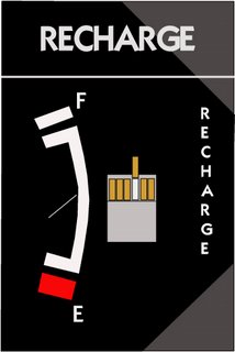
Cigarette cover design 1

Sometime we say "Recharge the nicotine" when we smoke. This idea comes from this sentence. This one is that i drew by Adobe Illustrate.
Comments:
<< Home
Lol, clever idea. Now for me to be a bit picky.
The vertical "RECHARGE" word needs to be center aligned instead of left aligned. The letters "A" and "G" are wider than the rest of the other letters and makes the entire word a bit off-balanced.
You should also adjust the spacing between the letters in the word "RECHARGE" on the top lid, especially the space between "C" and "H" as well as "G" and "E".
Post a Comment
The vertical "RECHARGE" word needs to be center aligned instead of left aligned. The letters "A" and "G" are wider than the rest of the other letters and makes the entire word a bit off-balanced.
You should also adjust the spacing between the letters in the word "RECHARGE" on the top lid, especially the space between "C" and "H" as well as "G" and "E".
<< Home

