Thursday, July 27, 2006
Cigarette cover design 2
Comments:
<< Home
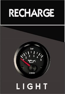
This design is not as interesting. Again, pay attention to the spacing between the letters in the word "RECHARGE".
The right side of the cigarette box is not even. The concept is good, but could have been better executed if the oil guage was an illustration as well. Or vice-versa, if the box was made more realistic.
Post a Comment
The right side of the cigarette box is not even. The concept is good, but could have been better executed if the oil guage was an illustration as well. Or vice-versa, if the box was made more realistic.
<< Home


